Brief
Mahi Mahi Beverages company is producing high quality gin beverages. Their products are crafted precisely to the small tasteful details. Their gin is very strong. Mahi Mahi Gin embodies the art of precision and passion — a drink crafted for those who savour life’s finest moments. Each sip carries the soul of the sea, the warmth of the setting sun, and the boldness of the wind.


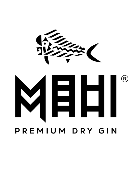
The name Mahi Mahi comes from a fish known for its strength and vitality, and in Hawaiian, it also means “heavy” or “strong.” I wanted to emphasize that bold and powerful character in the design. For the main graphic, I chose simple yet commanding typography infused with an exotic Hawaiian influence — a double “M” that subtly hides a fish’s tail within its form.

Mahi Mahi crafts three unique gin flavours, each with its own character and mood. To capture their individuality, I designed three distinct labels — each brought to life with a vibrant colour palette and smooth gradient overlay that reflects the spirit and flavour within.

