Brief
DooH Solutions & Services is entering a new chapter — one defined by growth, innovation, and a modernized visual identity. The rebrand reflects the company’s evolution into a strong, reliable, and approachable partner for clients in the Digital Out-of-Home (DOOH) industry.
Their mission is to help businesses focus on what truly matters by delivering a complete suite of DOOH services — from strategy to execution. What truly sets DooH Solutions & Services apart is their highly skilled technical team, whose deep expertise and long-standing experience make them a trusted one-stop partner for all things digital signage and out-of-home technology.
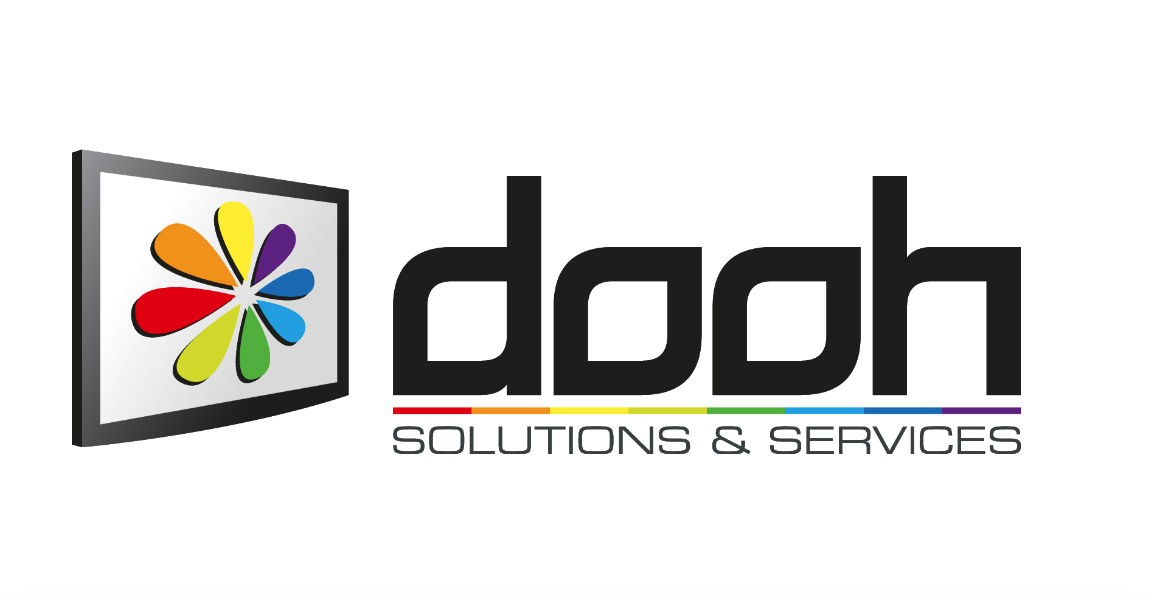
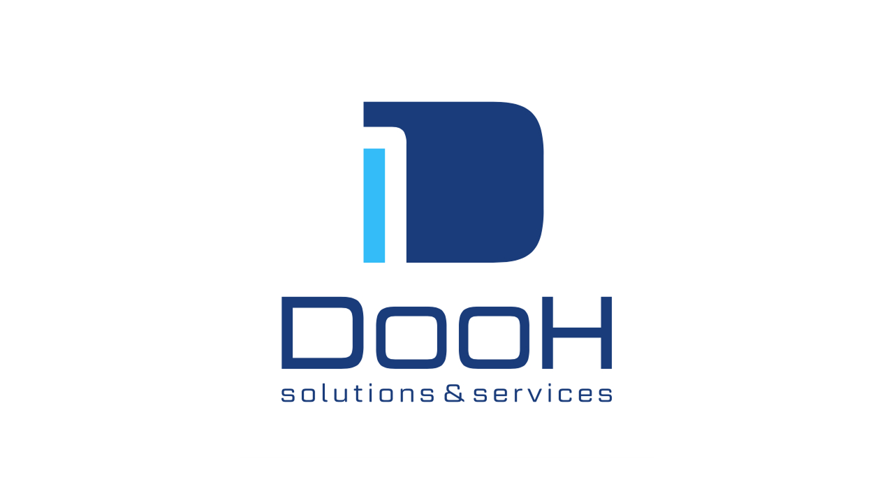
Old logo vs. new logo design
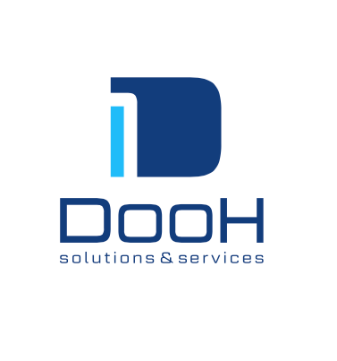
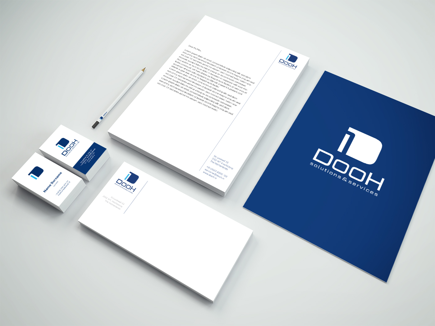
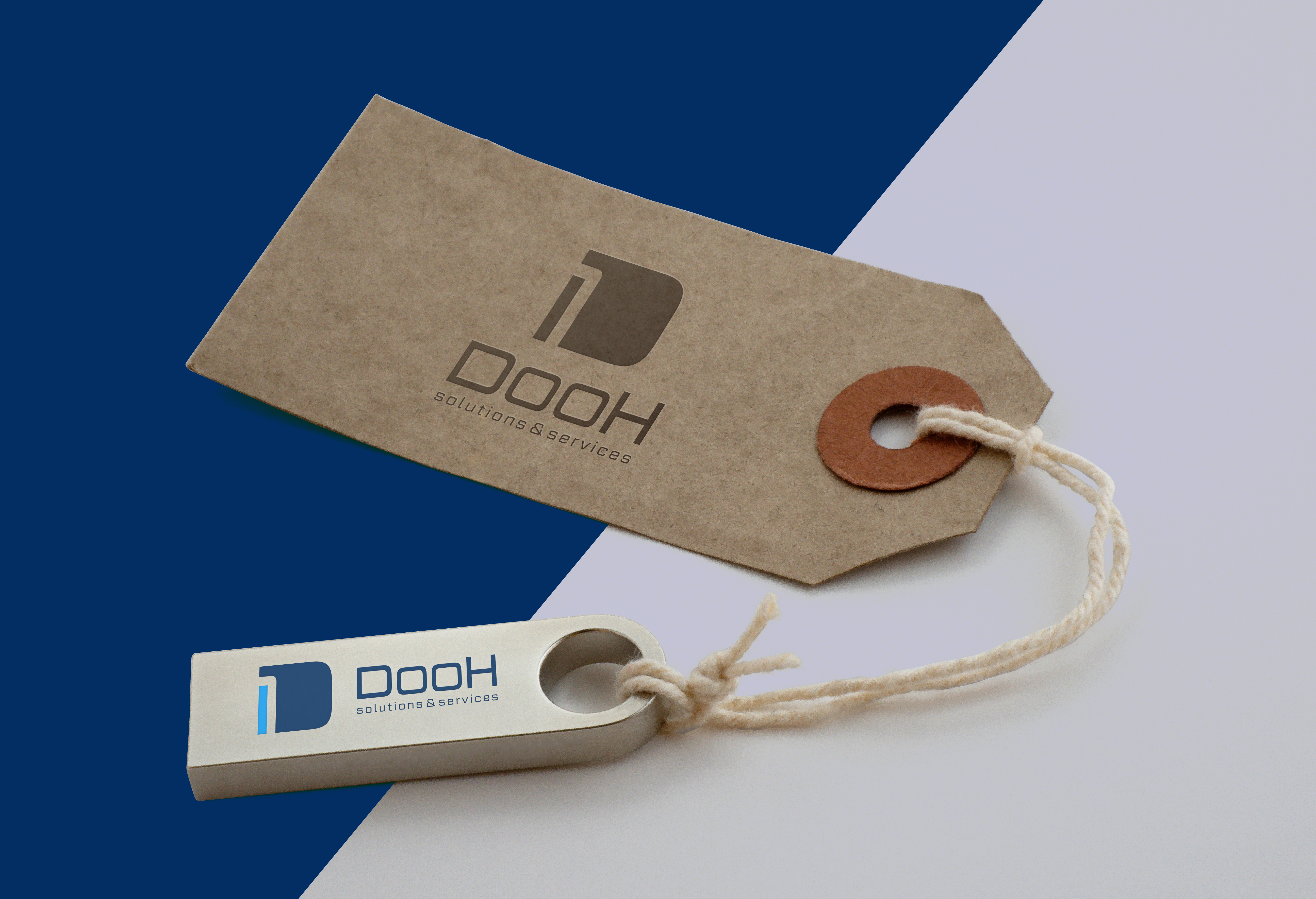
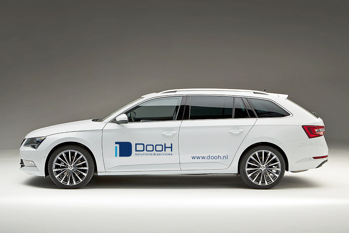
The dominant “D” letter serves as a main icon, with a curved line dividing it into two parts, creating an invisible number 1. The look is rectangular, technical, and simple, featuring an angular, sans-serif logotype. Simplicity is a key factor in their mission to make life easier for clients by offering straightforward solutions.
Contrasting shades of blue symbolize reliability and security. Darker blue represents deep technical knowledge, while lighter blue conveys friendliness, creativity, and helpfulness.